The task of updating graphic in Medieval Writing grinds relentlessly on as a result of the generosity of the British Library in making their colour images available for mere mortals like me to use. The latest update is an example of insular minuscule from the 12th century Irish Gospels of Maelbrigte. The sample includes a nifty initial with beasties and comes with a script example and paleography exercise.
The passage is one of my favourites from the Vulgate Bible, the beginning of the Gospel of St John. I guess I like it because it seems to be a massive word play in which sentences and phrases hook together like links in a chain, repeating something of the previous expression while introducing a new concept, which is in turn linked back. This is unusual as the structure of the gospels texts is generally plain narrative, although John does have some repeating tag lines for emphasis, like the one which appears in the King James version as "Verily I say unto you ..." I just wonder how this particular passage got there and why.
Insular minuscule is also my favourite script, partly because of its uniqueness and elegance, and partly because it proudly flew its flag for centuries when all of continental Europe was going all boring and Carolingian. OK, some folks say that makes it hard to read, but it isn't really. It just has its own code. It's really quite consistent and logical within itself. Enjoy it.
Saturday, March 29, 2014
Friday, March 21, 2014
Colophons and Marginalia and All That
I love beautiful medieval illuminations as much as the next time travelling aesthete, but I have always had a fascination for the words. Perhaps even more interesting than the words of the main text, which earnest scholars have translated, edited and argued over for decades, are the extra words which scribes have added in margins, between lines, on flyleaves and at the ends of texts. The little personal prayers that are added into blank spaces in professionally produced books of hours add individuality, even if they are scratched on to the page in less than calligraphic style. They can give you a little peek at how the book was used and regarded by the folks who owned it, wrote it or read it hundreds of years ago.
This has become something of a fashion in paleographical and codicological studies these days. Scholarly tomes have been written on the subject and there is a website, Annotated Books Online, which provides digital facsimiles of mostly early printed books with handwritten annotations.
This is why I used the colophon from the Lindisfarne Gospels as an example of insular minuscule writing in Medieval Writing. The graphics for that exercise have now been upgraded courtesy of downloaded colour images from the British Library, where all pages of that historic work are now online.
So why did Aldred, scribe of the gloss, describe himself as an unworthy and most miserable priest? Was it a polite conventionality, or was he truly in awe of the mighty work which had been produced a couple of centuries before? Can you imagine him standing before the abbot jabbering, "What! You want me to write all over this! Are you kidding? Oh dear Lord I am so miserable and unworthy." OK, so I am getting a little imaginative here, but somehow it makes it all a little more human.
Thursday, March 06, 2014
Updated Graphics - Again
Some years ago, when the British Library put up their Turning the Pages digital display for a few of their very finest treasures, I discovered that there were people who thought that the Lindisfarne Gospels was a picture book and that it contained about seventeen pages. I guess my interest in paleography grew partly out of a passion for the words in books. Medieval manuscripts, for all the elegance and beauty of their illustrations in many cases, are still verbal narratives.
But they can still look gorgeous. I have updated the images in Medieval Writing for the script example and paleography exercise for the insular half uncial of the Lindisfarne Gospels with new colour images courtesy of the British Library, which now has a full digital facsimile with no turning pages, but all of them displayed.
While my wee sample is basically about the letter forms, nonetheless the spiffy dragon initial looks awesome in living colour.
Sunday, March 02, 2014
Manuscripts and Stained Glass
It may be giving me a split personality, but I have been dividing my medieval time (I do have other time!) between updating things, mainly links right now, on Medieval Writing and trying to organise my humungous photographic project on Flickr. I am battling my way through a whole swag of pictures of stained glass at the moment, which has prompted a few thoughts. Dangerous.
The pictures were all taken under urban guerilla conditions, and so are not as detailed, perfect in colour, crispness and verticality as those ones which appear in beautiful art books, but they probably give a better impression of what people, medieval or other, actually saw. That leads to a few thoughts on their function. The traditional take on this is that they were essentially didactic, providing lessons to the illiterate. Hmmm.
The first time I visited Chartres cathedral, I thought initially it must not be open to visitors as it was pitch dark inside. Then it became apparent that there were people in there, and my husband and myself were both mystified as to why there were no lights on. It was a very bright day outside and we had to stand for about 15 minutes until our eyes adjusted before we dared tackle navigating around. And then something extraordinary happened. The whole place just started to shimmer with colour, constantly changing as the light changed behind the heavily coloured 13th century windows. It looked nothing like a picture in a book, but one can only imagine the impression on the citizens of medieval Chartres, which was probably as dingy and smelly as most medieval cities outside the cloisters. Add all the colour and gold which has been scrubbed off the interiors of medieval churches in modern times and the whole impression must have been dark and colourful, shiny and aromatic, and alive; maybe a glimpse of Paradise.
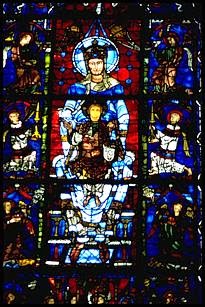
See, a photograph just doesn't do it. It just sits there. In the building, all the little figures and scenes tend to dissolve in a shimmer of moving colour. Of course, by the 15th century stained glass had got bigger and bolder and lighter and easier to resolve, but then the populace had become more literate as well.
The illustrations in manuscript books are right there in front of the reader, able to be interpreted in all their complexity. For modern viewers, they have generally weathered the test of time better as well, not dissolving into confused fragments with repeated repairs to the windows. The owners of manuscript books were not, of course, the poor people, and probably at least a bit literate, even if the pictures were more informative to them than the black scratches on the pages.
No doubt the windows were reminders of the lessons learned aurally, but somehow I just can't see the illiterate townsmen and women screwing up their eyes to try to follow the narrative sequences in tiny little roundels and matching up the types with the anti-types fifty feet above the floor. There just has to be a little mystery.
Subscribe to:
Posts (Atom)